
When to Mix Watercolour on the Page vs in the Palette
- Blog
- July 29, 2026
- 25 mins
There’s a small moment that trips up a lot of sketchers, and it has nothing to do with drawing. You finish your line work, you’re pleased with it, and then you sit down in front of your paints and freeze. Susan, a sketcher on our 4 Week Experience, put it perfectly:
"I can spend ages on my sketch, absolutely loving it, and then I come to the paintwork and I have no confidence and a 50-50 chance of ruining it. My colours come out either too dark, too pale, or muddy."
– Student Susan
If that feeling is familiar, you’re in good company. A surprising amount of it comes down to one small decision most of us never stop to make: where are you actually mixing your colour, in the palette or on the page?
There’s no wrong answer, because it isn’t a choice between two camps. Mixing on the page and mixing in the palette are two different tools, and most strong sketches use both. Here’s how to tell them apart, with examples from real sketchers and from across our courses.

The two kinds of mixing
Mixing on the page (or “wet on wet”) means laying clean water or a first colour down, then dropping a second colour into it and letting the two meet by themselves. You set up the meeting and let it happen.
Mixing in the palette means combining your colours in the tray first, to the value and strength you want, and only then carrying that finished colour to the paper. You know what you’re getting before it lands.
One is about life and variation. The other is about control and consistency. Once you can feel that difference, the decision gets easy.
When to mix on the page
Reach for page-mixing when you want life and natural variation. It’s quick, it keeps your eyes on the subject, and it gives you shifts of colour you could never plan.
You see it most clearly in the Barcelona Cathedral workshop. Ian reaches past the “correct” grey stone and mixes Winsor Violets with Indian Yellow, in his words, “right there on the page. Not on a palette. On the page.” The two “have a little play together” and make a warm gold that no single tube could give you. Drop two colours next to each other on wet paper, he says, and watch what happens, rather than deciding the result in advance.
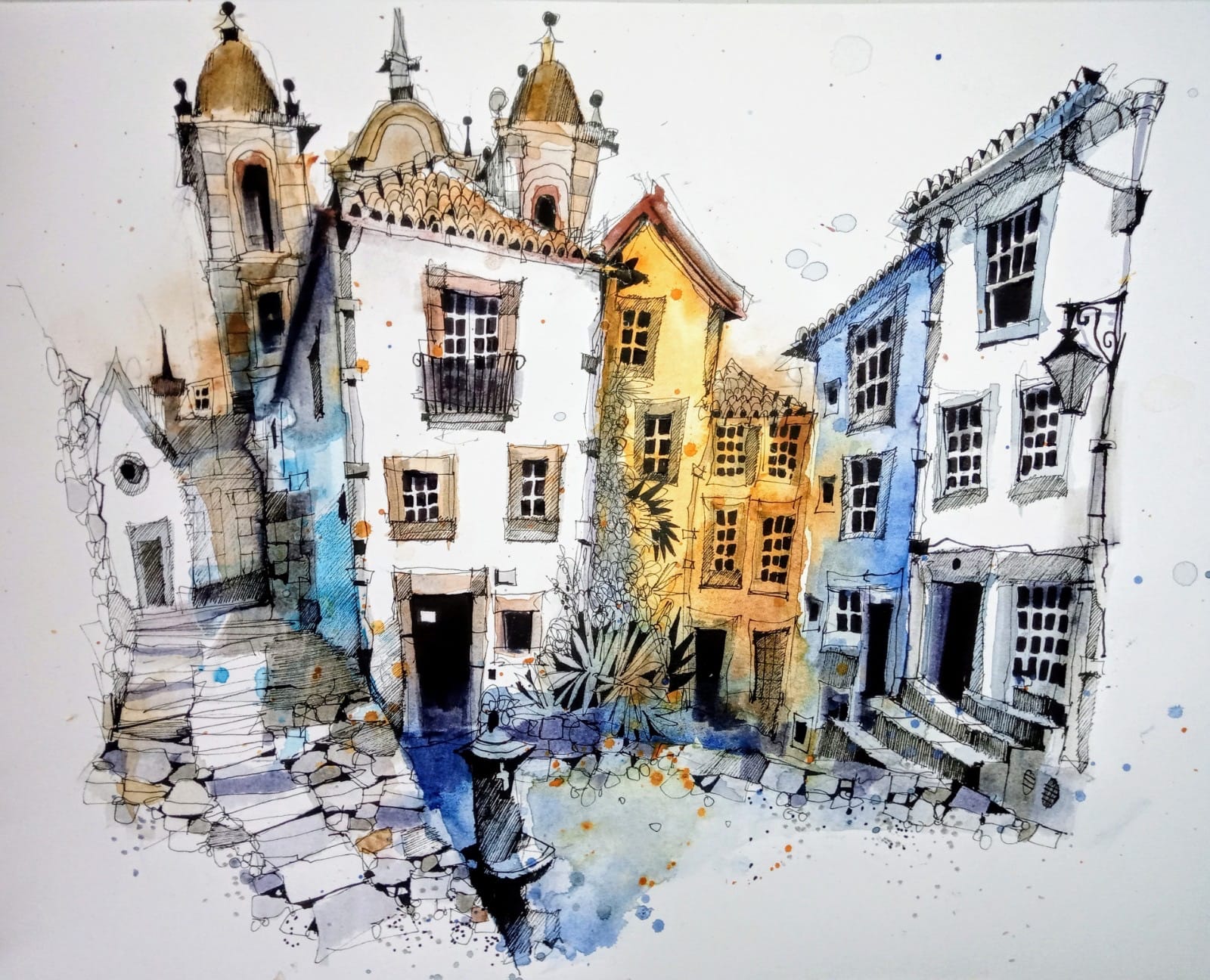
The same move drives the colour on the 4 Week Experience. Ian runs Prussian Blue straight into Brown Madder down the side of a building: crimson at the top, a washy blue below, the two blending and dropping into the rocks. That’s a full range of light to dark and warm to cool from a single passage. Mix those two in the tray first and you’d get one flat colour.
It’s how you get lively water, too. On the beginners course, painting the River Severn, Ian ignores green altogether and drops Transparent Orange into Cobalt Turquoise Light on wet paper, for a depth a single tube green never reaches.

Gillian, a sketcher on the 4 Week Experience, ran into the flip side of this. She said she still leans toward a traditional watercolour style and finds the looser “outside the lines” approach a challenge, and she’d fallen for Brown Madder but wanted to keep it deep “without losing the translucency.” The answer is the same: let it mix on the page with plenty of water. Translucency comes from water, not from working the pigment harder.
And that’s the thread through all of it: water. As Ian says, the colours matter, but the water matters more. Be generous with it, and work it slowly. Don’t mop at the paper in fast strokes, lay a good amount of pigment down and push it around gently.
When To Mix In The Palette
Reach for the palette when you need control: a specific value, a steady neutral, or a colour you’ll repeat and need to match.
On the 4 Week Experience, when Ian had lots of flat areas of pink to lay in, he mixed Brown Madder and a little white into a small “soup” in his tray, on purpose, and kept coming back to it. When parts of a sketch need to agree with each other, the palette is where you make that happen.
During the Seville retreat demo, he showed the same idea with grey. When a scene needs the same quiet grey in several spots, mix it once: Burnt Sienna with Ultramarine and a touch of white makes a warm grey that sits back nicely, and one puddle means every roof and shadow that shares it will match.
The palette is also where you mix a set of colours deliberately. Filming the Rural Sketch Course in the Lake District, Ian mixed eight different greens from just a few blues and yellows, rather than reaching for a tube green. Prussian Blue with Indian Yellow gives an earthy, mossy green; a cooler blue gives a green that recedes into the distance. Mixing those as small puddles on the palette lets you place warm greens in the foreground and cool ones behind, so the scene reads with depth.
On the Dublin retreat studio day, the group began with the real, local colours of the pubs, a grounded palette of blues, browns and greens, before weaving in complementary shades to lift it. That day also came down to knowing your paints: transparent washes let the paper glow, opaque colours sit more solidly and cover what’s underneath. Deciding which you want is a palette decision you make before the brush lands.
A tip that saves a lot of mud: keep a spare strip of the same paper beside your sketch, and before committing a new colour make two tiny tests, one page-blend and one palette-mix. Use whichever gives the right value with the least fuss.
Most strong sketches use both
The sketchers whose colour feels alive aren’t picking one method forever. They move between the two, often within a single building:
- Block your big shapes with on-page mixes. Clean water first, then two pigments left to find each other.
- Reserve the palette for colours you need to repeat. Mix one controlled puddle and place it wherever the scene needs to balance.
- Stop a touch early, and save the crisp darks for the brush pen stage once the paint is dry.
Page for life. Palette for when you need the same note twice.
Two mistakes worth avoiding
Don’t soak the whole page before you start. Once everything is wet you lose the hard edges that make an urban sketch read. Wet the areas you want soft, and leave the rest.
And don’t go too dark too soon. This is the one Donna on the 4 Week Experience, was working against. As a watercolourist she knows the pull to solve everything at the paint stage, so this time she held back, in her words “trying not to paint the dog before I paint the fleas.”
Keep your early layers light. If a passage does get too dark, Ian’s fix is simple: stop adding pigment, add clean water, and push the colour around slowly. Mud is usually just too much pigment and too little water.
A simple practice to try
Pick a subject you know well, even a doorway or a downpipe. Paint the first layer with on-page mixes only, to block the big shapes and let the colour move. Once it’s dry, mix a single grey in the palette and drop it into three spots to link the scene. Add a few darks with a brush pen, then stop. Notice one passage that felt alive and one you’d change next time. That noticing is where the skill grows.
And if, like Susan, the paint stage is where your confidence wobbles, this is the shift that steadies it. Colour that feels alive and colour that feels calm aren’t two different talents. They’re just two different places to mix.
Ready to learn more?
If colour is the bit of sketching that steals your confidence, Ian’s Colour Chart Book is built for exactly that. It’s his most popular resource, and it does one job beautifully: it makes colour feel simple and instinctive instead of a gamble.
Inside, Ian shares the exact colour combinations he’s developed over decades of urban sketching, using just three to five colours plus white. You’ll see how to mix warm and cool tones, when to reach for complementary hues, and how to bring the right mood, depth and life to a scene.
When to Mix Watercolour on the Page vs in the Palette


About the Artist
Ian Fennelly focuses on capturing urban spaces and environments by drawing the places where people have been without actually including them.
His process involves layering watercolors, brush pens, and liners to build depth, texture, and detail, allowing them to fully immerse in the scene while adapting to changes in their surroundings.

About Urban Sketch Course
- More Blog Posts -

- 16 mins

- 19 mins
- 13 mins

- 10 mins