From Colour Confusion to Creative Confidence
Choosing colours can feel overwhelming for many beginner artists. It’s easy to sit with a sketchbook, brush poised, and feel a wave of hesitation.
Where to even begin?
Fortunately, colour theory is not about memorizing complicated rules. It’s about understanding a few simple ideas that make choosing colours feel natural and even joyful.
The Colour Wheel: A Friendly Compass for Beginners
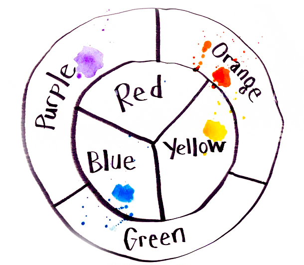
The colour wheel is the heart of colour theory.
It isn’t designed to intimidate; it’s a simple, visual guide that shows how colours relate to each other, much like neighbours in a small village.
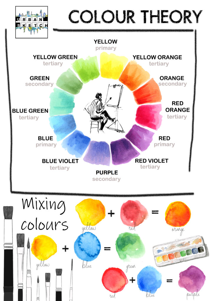
Primary colours: Red, Blue, and Yellow. These colours cannot be created by mixing others.
Secondary colours: Green, Orange, and Purple, each made by blending two primaries.
Tertiary colours: The in-between shades, like red-orange or blue-green, created by mixing a primary with a secondary.
Understanding the colour wheel gives artists a foundation to build harmonious, visually pleasing sketches without second-guessing every choice.
The Secret to Simplifying Colour Choices
One of the most common frustrations for beginners is choosing which colours to use. The temptation is often to use every colour available but the most beautiful sketches often come from a limited palette.
Professional artists, including Ian Fennelly, often work with just three or four carefully chosen colours. By repeating these colours throughout a sketch, they create harmony and cohesion without overwhelming the viewer or themselves.
To make colour selection even easier, Ian Fennelly has created a Colour Chart Book.
This stunning collection features Ian’s personal go-to colour combinations and annotated sketches from the past five years. It offers beginners a rare behind-the-scenes look at how a professional simplifies colour use and turns it into an expressive, joyful process.
For those feeling unsure where to begin, this guide offers an inspiring and practical shortcut to colour confidence.

Helpful Tools for Colour Planning
For those who prefer digital help, there are easy-to-use online tools that can take the guesswork out of planning a palette:
Canva’s Interactive Colour Wheel – explore complementary, monochromatic, and triadic colour schemes.
Paletton – create complex, beautiful palettes with just a few clicks.
Coolors.co – generate instant palettes and tweak them until they feel just right.
These tools allow beginners to borrow tried-and-true combinations and gently train the eye for balance and harmony.

A Simple Exercise to Start Today
A small challenge can make a big difference.
Beginners are encouraged to choose just three colours today – one primary, one secondary, and one personal favourite – and create a mini sketch using only these.
This exercise teaches the magic of limitation. Instead of feeling restricted, most artists find that a limited palette creates surprising cohesion and style, allowing their unique voice to emerge.
Colour is not about perfection. It is about feeling, connection, and expression.


Ready to learn more?
Colour theory is not a set of rules to memorize. It is a conversation between the artist and the page.
And like any meaningful conversation, it grows richer with time, patience, and playful experimentation.
Every sketch, every colour choice, is a step closer to creative confidence.
Learn the art of urban sketching with Ian Fennelly in our Beginner’s course as he guides you through 47 easy-to-follow lessons, with practical exercises, that transform you from complete beginner to skilled urban sketcher!