A bridge is one of the most impressive things a town or city puts in front of you. All that steel and stone, the cables fanning out, the way it marches across the water and shrinks into the distance. It looks like a feat of engineering to draw, never mind to build. So a lot of sketchers admire it, photograph it, and never open the sketchbook.
That is a shame, because a bridge is one of the most rewarding things you can draw. It gives you strong shapes, natural perspective, water to play with, and a built-in sense of drama. And you do not need Tower Bridge or the Brooklyn Bridge to get it. A small footbridge over a canal will teach you the same things. Here is how to approach one without freezing.
Start with the big shapes, not the cables
The most common mistake is starting with the detail: the cables, the rivets, the railings. Do that and you will be lost in ten minutes.
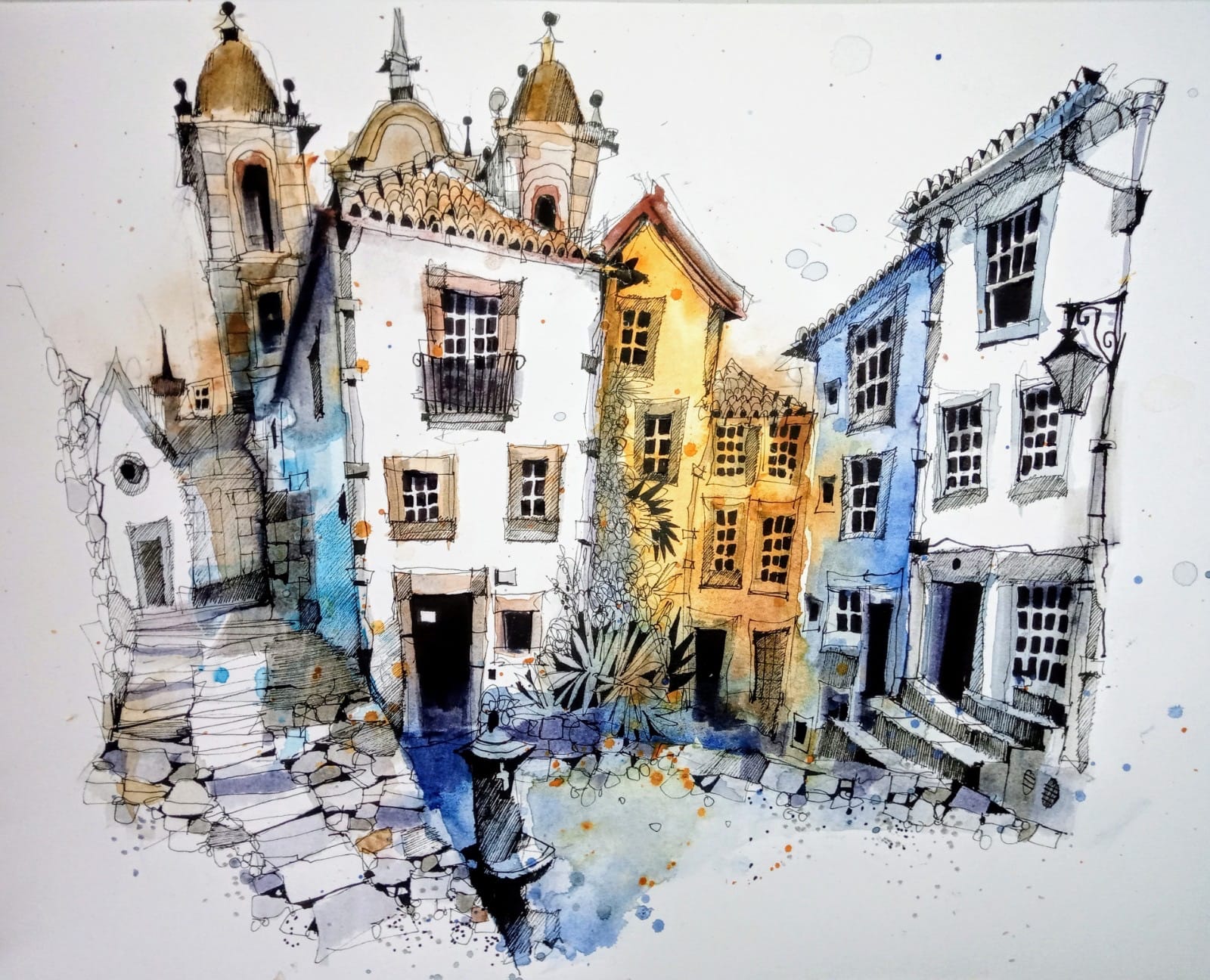
Ian starts every bridge the way he starts everything, with the big shapes. As he puts it, working on the Millennium Bridge, it is “still starting off with the big shapes and then going over the medium shapes and the colour.”
So block in the deck, the towers or arches, and the line where the bridge meets the water. Get that structure sitting right on the page first. Everything else hangs off it. The cables and the ironwork come much later, and there will be far fewer of them than you think.
Perspective, without the maths
Bridges are perspective made visible. You do not need to name a vanishing point or measure an angle. You just need to follow the sweep.
Watch how the deck narrows as it moves away from you. Notice how the railings on the near side sit lower and larger than the far side, and how a suspension bridge’s cables rise and fall in a long curve. Draw what you see that sweep doing, and the perspective looks after itself.
Ian often exaggerates it. He will let the near end loom a touch larger and the far end shrink a touch faster than reality, because a little drama reads better than strict accuracy. If your bridge leans or bows slightly, that is not a mistake. That is character.
The Water Is Half The Picture
Most bridges come with water, and the water is not a background. It is half the sketch.
Reflections give a bridge its weight and its stillness, and they are easier than they look: a few vertical or wobbling marks pulled down from where the structure meets the water, and plenty of white paper left alone. Do not fill it in. The gaps you leave are the light on the water. Under the Millennium Bridge, Ian leaves whole stretches of the river untouched, and it reads as shimmer.
Do not fear the big view
With something like the Brooklyn Bridge, the temptation is either to shrink it to fit or to cram the whole Manhattan skyline in behind it. Resist both.
Give the bridge room. Let it be the star, keep the skyline behind it as simple, soft shapes, and let the sheer scale of the thing come through. A big subject drawn simply always beats a big subject drawn fully.
Old bridge or new, it is the same job
A Victorian giant like Tower Bridge, all turrets and stonework, looks nothing like the lean steel of the Millennium Bridge, and neither looks like the honest stone arch of the Bishops Bridge in Barcelona. The job, though, is the same every time. Find the big shapes, follow the perspective, suggest the structure, and let the water do its work.
What changes is only the character you lean into: the drama of the old, the clean lines of the new, the worn charm of the ancient. Decide what your bridge is really about before you start, and every mark after that has something to do.
Let the colour carry the mood
In real life a bridge is mostly grey and brown, which sounds dull and really is not. A bridge comes alive the moment you stop copying the colour in front of you and start choosing it.
Ian works from a small, limited palette and lets warm and cool play off each other: a warm stone or a rusted iron set against the cool blue of the water and the sky. Keep the colours few, and let them mingle on the page instead of mixing them down to a careful, even grey. A little warmth in the structure and some coolness in the water will always feel more alive than a bridge painted in accurate, matching tones.
Start with the one near you
You do not need a famous river crossing to begin. A canal footbridge, a railway viaduct, the little bridge in your local park: all of them give you the same lessons in shape, perspective and reflection. It is no accident that Ian opens his Beginners course with a bridge, the English Bridge in Shrewsbury. Its strong, simple perspective makes it one of the best first subjects there is. Find one near you this week, block in the big shapes first, and see how much of the detail you can happily leave out.
Ready to learn more?