
Change the Colour, Change the Story
- Blog
- November 4, 2026
- 35 mins
In Bath, Ian used yellow ochre in every single sketch for a week. Partly because the stone is that colour, and partly because Rebecca bet him he couldn’t.
In New Mexico, his key colour didn’t come from the landscape at all. It came from the turquoise jewellery in the shops of Santa Fe.
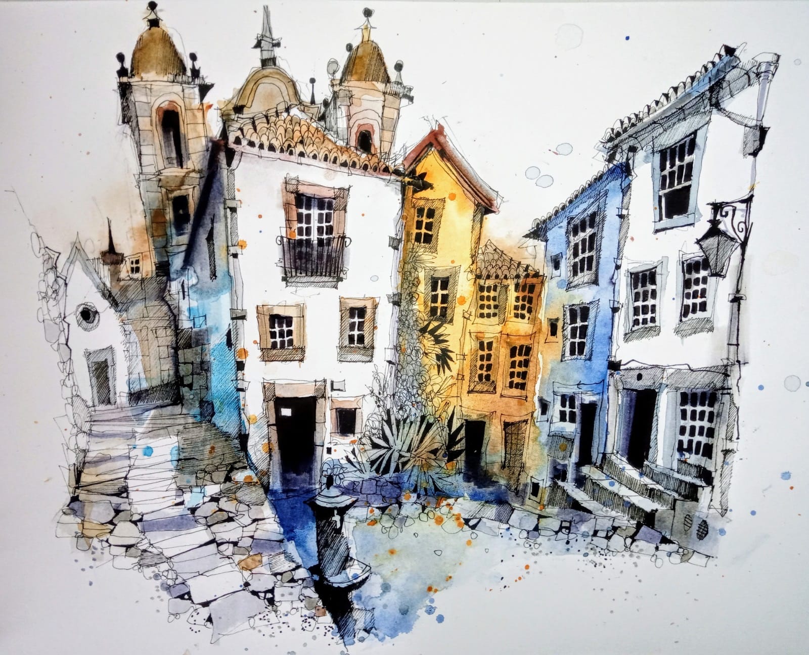
And in the white villages of Andalusia, the most important colour was the one he didn’t paint.
Three very different decisions. But behind every one of them is the same short list.

At our latest live webinar for PLUS members, “Change the Colour, Change the Story”, Ian explained that he usually works with just three, four or five colours on a workshop. Maybe six, if he’s struggling. And every colour has to earn its place for at least one of four reasons:
- A range of temperatures
- Complementaries
- A local reference
- Emotion
That’s it. Here’s what each one means, and where you can see it in his sketches.
A range of temperatures
Ian wants cools and warms in every palette, and he normally has two blues. Temperature is what pushes things back and pulls them forward.
When a member asked why he’d made a lamppost red in one of his Amsterdam sketches, the answer was simple: to make it jump forward. A warm colour against cooler surroundings.
He doesn’t always follow the textbook, though.
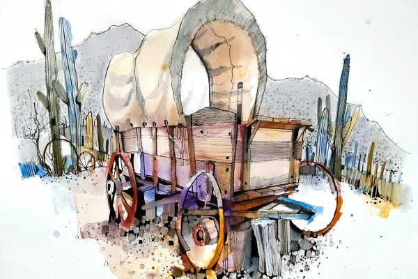
In his New Mexico corral sketch, the cool cobalt turquoise is in the foreground and the warm mountains are in the distance, which is the opposite of the usual rule.
A member asked whether the colour was what gave the picture its tension, and its unity.
“The cold, which should be at the back, is actually in the foreground, and then the warmth of the mountain, which should be jumping forward, is kind of pushing back. It’s in the distance. So I’ve reversed everything. I’ve reversed that traditional idea of cools at the back and warm at the front. But I think the unity, as you say, probably comes from the tonal value... it ties in with the background as well, because tonally it’s the same.”
– Ian Fennelly
So temperature is a tool, not a rule. Know what it does, and then decide.
Complementaries
Complementaries are colours opposite each other on the colour wheel. Mix them together and you get muted, softer values, which is exactly what Ian wanted in York.
York is narrow medieval streets, timber-framed buildings, brickwork and flagstones, and an awful lot of grey and brown. He didn’t want a sketch full of grey and brown, so he dropped everything down on purpose. The York Minster sketch used colours like Winsor violet, green gold and manganese blue. The Little Shambles used sepia, Prussian blue, transparent orange and Indian yellow.
Here’s how he gets so much out of so few colours.
He puts the two complementaries down separately on the page and lets the water push them around. Then, for the more muted notes, he mixes the same two colours together on the palette with a little white. So you get each colour on its own, plus the muted mix of the two, and four colours end up looking like many more.
The white surprises people, because plenty of watercolour painters would never touch it. Ian’s answer is that the complementaries don’t drop down far enough without it, and the white gives walls, floors and stones a solid quality.
"I'm really drawing and I'm drawing with paint. So I'm gonna use whatever tool is available to me to kind of express the stories that I'm trying to create."
– Ian Fennelly
Complementaries also give you livelier greys than black and white. Ian agreed with a member on that, though he still likes a plain grey sometimes. In Amsterdam he used black paint for the dark depth under bridges and in the black buildings, then mixed black with white and a little burnt sienna for a warm grey.
His advice: if you’ve got black in your palette, try it and see what happens.
There’s much more on this in How to Mute Your Colours Without the Sketch Going Flat.
A local reference
This is the one that makes a sketch feel like a particular place. Something realistic, taken from what’s around you.
Sometimes it’s right in front of you. Bath is built from a gorgeous golden, honey-coloured stone, so on the first morning of our retreat there in May, Ian decided he’d use yellow ochre in every sketch that week. Rebecca bet him he wouldn’t manage it. He admits he didn’t really want to by the Wednesday, but out of pure stubbornness he kept going and used it in all five. (She still hasn’t paid up.)
The real win wasn’t the bet. Having one colour run through every picture gave each sketch a focal point and bound the whole week together. It helped the students too. After a couple of days, they knew exactly how yellow ochre behaved, how it mixed, and how it changed with more or less water.
Sometimes the local reference isn’t in the scene at all.
In Santa Fe, a couple of hours from Ghost Ranch, cobalt and turquoise stone is mined locally and made into necklaces, brooches, rings and earrings. Ian found it so inspiring walking around that he put it straight into the pictures, as cobalt turquoise light.
He used it mainly for the space between things: in the corral sketch, the fences on the left are left white with the turquoise behind them, and on the right it’s reversed.
And sometimes the local reference is simply green. In landscapes closer to home, in Burwardsley, Irby and North Wales, you can’t ignore the greens, but you can play with them. Ian mixes a range of greens from his blues and yellows, alongside a pure green like Winsor green.
His key tip: if you mix a green from, say, Prussian blue and Indian yellow, don’t only use the mix. Use the blue and the yellow in their pure form somewhere too, in a shadow or a foreground. With a limited palette, you need to get the most out of every colour.
The greens that have earned a place in his palette are Winsor green, green gold and emerald green, and he counts cobalt turquoise light as a green as well.
If your landscapes keep coming out flat, Why Your Landscape Sketches Look Flat (And The Fix) is a good next read.
Emotion
The last reason is how the place makes you feel. It’s the hardest one to pin down, and it’s the one that turns a record of a place into a story about it.
In York, the muted palette wasn’t only about theory. It was about the age of the buildings, the atmosphere and the oldness of the place, and a city full of ghost stories. That’s why he reached for indigo, a colour he warns has to be used very sparingly or everything goes grey.
"I would only do it really for a course like this, when it was very much in tune with what I was trying to express and capture with the spirit of the places."
– Ian Fennelly
His York Minster sketch ended up with an almost ghostly feel, which he says happened completely by accident. But the soft layered washes and muted colours were there to capture the creepiness of the place, and it shows. (So does our resident ghost, Creepy Richard.)
Andalusia went the other way. Ian had only just come back from the mountain villages north of Malaga when we went live, and these sketches were days old. The villages are full of gorgeous whitewashed buildings, steps, plants and trees, and this time the colour went in very strong, quite dark and full of pigment, with plenty of what he called emotional and observational reference points. It was all about capturing the nature of those places.
Same intention as York, he said, with a completely different subject and atmosphere. In York, the colours went quiet to capture something old and spooky. In Andalusia, they went bold against all that white. You’ll see the Andalusia sketches on our social media soon, and PLUS members can already see them in the webinar recording.
The colour you leave out
Andalusia’s bold colours only work because of what Ian didn’t paint. Someone on the workshop asked him what colour to paint one of the buildings.
“Well, what colour is it?” he asked.
“It’s white.”
So don’t paint it. Just leave it, and you get a fabulous contrast. Leaving the buildings white is exactly what lets the colour around them go so strong. If those buildings were a mid-grey or brown, Ian said, the colours would be far too much. Instead, the whites keep everything grounded, and in some sketches the bold colour runs around the edges almost like a frame.
It’s something he kept coming back to: deciding what not to paint matters as much as choosing what to paint.
A member who was new to sketching said she struggles not to paint everything. His advice was to start with what you’re trying to express. In the vast, empty landscape of Ghost Ranch, the obvious way to show all that nothing was to use nothing, so the meadow is left white.
"Every time you put colour on, you're affecting the tone of something."
– Ian Fennelly
When he’s working, it’s one decision at a time. Start with the thing that made you choose the scene. Then ask where you don’t need to paint. And stop sooner than you think, because the brush pens and the detail stage are still to come.
A few things that matter as much as the colours
Water. Asked whether water and saturation are important when he’s choosing and applying colour, Ian’s answer was “100%”. The water is more important than the choice of colour. His method is water, then pan, then paper: wet the brush, pick up the paint, put it down, rinse the brush, flick off the excess and push the paint around with clean water. That gives you a wash that goes from dark to light, all in about ten seconds. More on that in When to Mix Watercolour on the Page vs in the Palette.
Keeping it small. His palette has about 24 colours, and he takes the same 24 everywhere, swapping no more than two or three. On any one workshop, he only uses three to five of them. If you’re putting a palette together for the first time, Ian’s 8-Colour Starter Palette is the place to start.
Getting it wrong. Does he ever pick a colour and regret it? “All the time,” he said. Usually it’s a green or a red, and mixing reds and greens together can give you some horrible browns. Because he’s only using a handful of colours, he simply stops using the one that isn’t working. He doesn’t tell anybody at the time. If your sketches tend to go muddy, Why Watercolour Goes Muddy will help.
Try it on your next sketch
None of this is a formula. A lot of Ian’s colour choices are intuitive, and the painting itself is only about fifteen minutes of a two-and-a-half-hour sketch. But each place starts with an idea, and the four reasons are how he gets there.
"This is what kind of drives me as an artist, you know, trying to find something in each place that kind of makes those places unique, and allow the colour to help me to express that."
– Ian Fennelly
So next time, before you open your palette, run through the four:
- Have I got a cool and a warm?
- Have I got a pair of complementaries I can mix to mute things down?
- What’s the one colour that belongs to this place?
- How does this place make me feel?
Then pick no more than five, and see what story they tell.
The webinar clearly struck a chord.
Sheila M. said afterwards it had inspired her to get back to doing another picture, after eight weeks without one.
Ready to learn more?
Live webinars like this one are part of Urban Sketch PLUS. You can put your own questions to Ian as he goes, and if you can’t make it live, the recording is waiting for you in the members area afterwards. Alongside it there’s new training every month, monthly critiques on the sketches members send in, and a friendly group to share your work with.
Change the Colour, Change the Story


About the Artist
Ian Fennelly focuses on capturing urban spaces and environments by drawing the places where people have been without actually including them.
His process involves layering watercolors, brush pens, and liners to build depth, texture, and detail, allowing them to fully immerse in the scene while adapting to changes in their surroundings.
About Urban Sketch Course
- More Blog Posts -

- 17 mins
- 15 mins

- 16 mins
- 7 mins