
Ian Fennelly’s 8-Colour Starter Palette
- Blog
- July 25, 2026
- 26 mins
Week two of our four-week sketching experience is the watercolour stage, and in the live call one worry kept coming up.
A few of you had been thinking about moving from the Cotman range up to the Professional watercolours, but weren’t sure the upgrade was worth it, and the thought of buying a whole new set of tubes felt daunting.
Nancy summed it up: “My palette is currently Cotman and I just don’t get the intensity of colour. I’m in the process of switching to Professional, even though I have imposter syndrome using it.”

So we put the question straight to Ian. If he were filling a fresh palette from scratch, or helping a friend do the same, which colours would he actually buy?
He keeps around twenty-four in his own box, and he’s the first to admit that half of them rarely come out to play. He had the list down to eight in seconds.
Here’s that beginner watercolour palette, why each colour earns its place, and why a small, well-chosen set will take you further than a shelf full of tubes.
Why eight colours beat twenty-four
It seems backwards. Surely more colours means more freedom? In practice the opposite is true, and it’s one of the first things you notice watching Ian paint.
Ian makes most of his colours on the page rather than reaching for a ready-made tube, and a small palette pushes you to do the same.
With only eight colours in front of you, you learn to blend, and blending is where the variety and life come from. A soft grey for a shadow, a muddy green for distant trees, a warm pink for a sunlit wall: none need their own tube. They come out of the eight you already have.

A big box works against that habit, tempting you to hunt for the perfect single tube for every shape, and sketches made that way often end up looking flat.
It’s the same instinct Ian brings to every course. Setting up the watercolour stage of our Italy experience, he laid out just five colours plus white and said of the rest of his box.
I've come up with five colours plus white. All the others are getting neglected today. They are not coming out to play.
– Ian Fennelly
Ian's 8 starter colours
Two blues, a bright accent, two earths, a yellow, an orange and a red. Between them they map almost everything you’ll paint on a normal week.
Ultramarine
A warm blue and a proper workhorse for skies and shadows. Dropped into burnt sienna it makes a whole family of natural greys and darks, with no black required.
Cerulean Blue
Cooler and more opaque. Lovely for soft skies and calm water, and for knocking a colour back when it’s shouting too loudly on the page.

Burnt Sienna
Warm brick and terracotta for rooftops and sun-warmed stone. It’s also half of your most useful mix, the grey you get with a little ultramarine.
Burnt Umber
A deep, natural brown for rocks, timber and shadow. It’s the calming colour of the set, the one that settles a mix that’s become too lively.

Cobalt Turquoise Light
The bright one. A small touch lifts water, doors, boats and shutters. Every palette needs one colour with a bit of pop, and this is it.
Winsor Yellow
One clean, reliable yellow. Once you’ve got a good yellow you can skip the golds entirely, which saves you two or three tubes straight away.
Transparent Orange
Warmth and glow for sunlit walls and terracotta roofs. Because it’s transparent, it stays luminous rather than going chalky.
Alizarin Crimson
Your red and your rose in one tube, and the close cousin of the brown madder Ian loves. A whisper of it warms almost any mix, and it’s how you’ll find your pinks and purples.

A note on white: titanium, not Chinese
Whatever colours you settle on, one thing belongs in every palette: a good white. And it matters more than it looks. Ian is particular here, he uses titanium white watercolour, not Chinese white and not gouache.
It comes down to opacity. Titanium white is the most opaque white you can get. Mixed with just a tiny bit of water on a rigger, it turns into a thick, creamy paste, ideal for drawing opaque details back over a sketch or covering up a mistake. A touch also turns a thin, transparent wash into something more solid, which is how Ian settles distant buildings and mountains back behind the brighter colours.
As he puts it in the Italy watercolour stage, adding the white “makes it a lot more solid.”
The alternatives don’t do the same job. Gouache adds opacity too, but it dries far more matte and tends to leave more visible stroke marks.
White gel pens, popular as they are, aren’t opaque enough and soak into the paper rather than sitting boldly on top.
Chinese white is more transparent again, so it can’t cover the way titanium does.
What these eight can actually mix
A palette isn’t measured by how many colours it holds, but by how many more it can make.
Start with the greys, the colours you’ll reach for most. Burnt sienna with a little ultramarine gives a warm, natural grey for shadows and stonework. Swap in cerulean for a cooler, softer neutral. Pairing a blue with an earth like this is the backbone of almost every mix Ian makes, and the fastest way to stop your sketches looking flat. It’s the move he demonstrates in the Italy watercolour stage, mixing a blue and a warm colour with a little white:
That complementary mix is just going to drop everything down and really sit nicely alongside some of the more vibrant colours.
– Ian Fennelly
Then the brights. Your yellow and a blue make greens, from fresh, light foliage with cerulean through to deep, shadowy greens with ultramarine. Alizarin crimson and a blue give purples, and warmed with a touch of yellow it shifts towards earthy reds.
For water, Ian likes the unexpected pairing of transparent orange and cobalt turquoise light, a combination you’d never guess from looking at a river, but one that carries far more life than a green straight from the tube.
Two earths, two blues, a bright turquoise, a yellow, an orange, a red and a white. On paper it looks modest. In practice it reaches into the hundreds.

Cotman versus Professional: is the upgrade worth it?
This is where the whole conversation started, so it’s worth answering plainly. The difference between Cotman (the student range) and Professional watercolours is real, and Ian doesn’t hedge on it. He remembers switching as a student and being amazed. The Professional paints give those clean, see-through washes watercolour is loved for, they mix without turning gluey, and they carry far more pigment, so a little goes a long way and a tube lasts a good deal longer. The higher price up front tends to even out over the life of the tube.
If you’ve been feeling like an imposter for wanting the better paints, let this settle it: there’s nothing indulgent about using tools that do what you ask of them. Good paint makes learning easier, not harder. And you don’t have to replace everything in one expensive afternoon.
Karyn shared how she did it: “I started with Cotman and they worked well, but when they ran out I replaced them individually with Professional tubes and refilled the pans that way.”
Gilli does something similar, keeping her first Cotman box for travelling and building up the Professional colours slowly for home.
Final Thoughts
If there’s one thing to take from all this, it’s that good artwork doesn’t come from owning every colour. It comes from understanding a few of them well.
A shelf of two hundred tubes is tempting, but most of them overlap, and plenty will dry out before you use them twice. What you actually need is a good selection of high-quality tones from the main colour families: a couple of blues, a clean yellow, a true red, a warm orange and a couple of earths, with white to lift them. Ian’s eight cover exactly that ground. You’ve the primaries to mix almost anything, the earths to calm and neutralise, and the opaque white to bring light back.

Quality matters more than quantity. Eight Professional tubes that flow, mix cleanly and hold their strength will take you further than a big box of student paints that turn gluey and muddy. Start small and well chosen, learn how the set behaves in your hand, and add to it only when a sketch actually asks you to.
That’s the real secret of a good palette. It isn’t the biggest set on the shelf. It’s the small, well-chosen handful you actually understand.
Ready to learn more?
Conversations like this one, and the chance to put your questions straight to Ian, are exactly what make Urban Sketch PLUS such a great way to advance your sketching. Alongside the live calls you get Ian’s full library of courses and workshops, along with a friendly community to sketch with. Come and join us.
Ian Fennelly’s 8-Colour Starter Palette


About the Artist
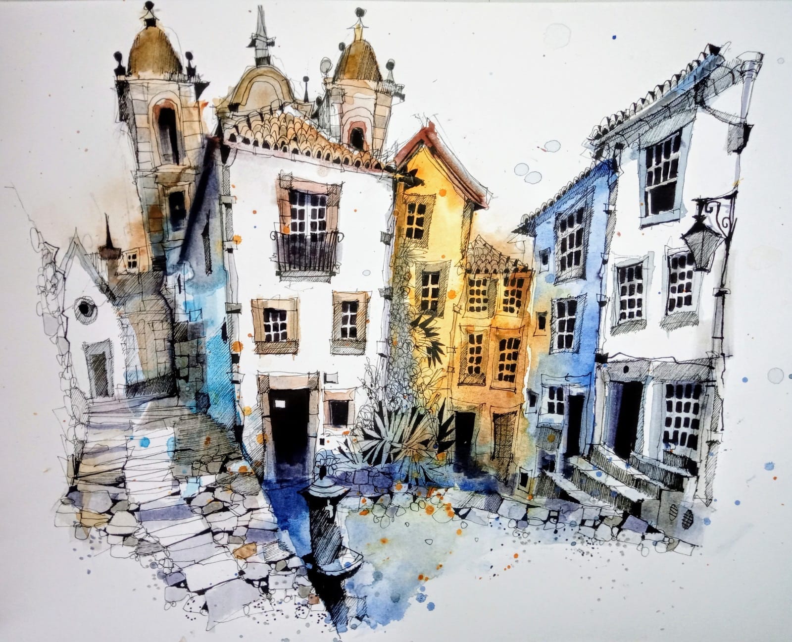
Ian Fennelly focuses on capturing urban spaces and environments by drawing the places where people have been without actually including them.
His process involves layering watercolors, brush pens, and liners to build depth, texture, and detail, allowing them to fully immerse in the scene while adapting to changes in their surroundings.
About Urban Sketch Course
- More Blog Posts -
- 29 mins


- 19 mins
- 14 mins